-
What We Do
-
AI NavigatorGain clear direction and momentum as your chart your organization’s AI path.
-
AI FoundationsEstablish the essential skills, systems, and mindset to support sustainable AI adoption.
-
Agentic AI LabExplore, prototype, and refine agent-driven solutions to accelerate real-world impact.
-
GovLabAdvance government innovation with practice AI solutions tailored to unique public sector needs.
-
-
Featured
 The AI Agent Advantage: Understanding Your Digital Workforce
-
Some Industries We Support
-
Featured
 Building Canadian Communities with Homegrown AI


Insights
Leveraging Regime Models to Boost Strategy Performance

We explore how a quantitative approach to market regime models can be used to improve allocations within a simple equity/bond strategy
The fact is that strategies that perform sub-optimally under certain market conditions can work surprisingly well in others.

Peter Bernstein
Market regimes are defined as periods of persistent market conditions, driven by a myriad of factors including macroeconomic, market trends, shock events, investor sentiment, and more.
And it is these key drivers, which can dominate in certain regimes, that have a significant impact on what strategies or factors work.
As a result, many market participants attempt to understand and predict the current “state” of the market and how the current state will affect securities prices.
In this article, we explore a quantitative approach to regime modeling that employs machine learning, and how it can be used to improve allocations within a simple equity/bond strategy.
Modeling Market Regimes
From crisis events, to raging bull markets, to choppy periods, market participants are always mindful of the current state of markets – what has been working and what hasn’t.
And whether classifying the current market with simple methodologies (bull or bear market definitions) to the complex (AI/ML driven classification), the general idea remains the same:
Can we categorize different time periods into specific regimes? Which are each differentiated by unique market characteristics and drivers during that period?
We believe that you can and that by using ML techniques, you can improve strategies and portfolio construction.
As an example, we are going to look at a regime modeling technique, that itself is inspired by the traditional regime model approaches like the hidden Markov models (HMM), but avoids some of its pitfalls.
In our specific approach, we are going to build a regime model based on the machine learning technique of clustering – where the model takes any number of macroeconomic flavored series as inputs to determine the market “state.”
Example Model – Leveraging Machine Learning
Before we jump into the specifics, at a high level, the model we are looking to build is highlighted in the following stages:
- Select relevant macroeconomic datasets (input data series)
- Conduct feature engineering using clustering:
- Denoise each input data series with the goal of identifying the most common historical mean and standard deviation (std dev) characteristics for each, across time. That is we want to encode “market state features” for our subsequent predictive model.
- Build a predictive model, again using clustering:
- Choose target data series, in our case AGG and SPY
- Use clustering to group the target data series into 3 market regimes (good, bad, medium) where we map the historical input series mean and std dev features (from step 2 above) to their predictive relationship with future market target variables
- Leverage predictive model in simple strategy:
- Build portfolios that allocate across target asset classes and understand how the input macroeconomic series contributes to those predictions across time
1. Input Data
We first start with a choice of input series, where for the purposes of this example we’ve chosen the following data:
- GLD (Gold)
- IEF (7-10 US Treasuries)
- HYG (High Yield Corporate Bonds)
- IEF – HYG (Risk premia associated with corps vs sovereigns)
- TIP (Inflation Protected Treasuries)
- CL futures (crude oil front month continuous contract)
- USD EUR (US / Euro exchange rate)
- FSI
- FSI is the Office of Finance Research Financial Stress Indicator, made up of 5 different components of market stress.
- AAIIS
- AAIIS is a weekly survey of market sentiment constructed by the American Association of Individual Investors.
2. Feature Engineering Using Clustering
With each of these input data series, we first denoise them by clustering them historically to capture their essential archetypal shapes (mean and std dev characteristics), akin to the patterns a technical trader might try to decipher. By archetypal, we generally mean “historically most common.”
For example, in the following chart, we show the model-determined clustered shapes across time, every 3 months, for FSI, for both the mean of the series and the volatility (i.e. std dev) of the series. In this case, we allow a max of 6 possible historical pattern shapes per series and statistical moment.
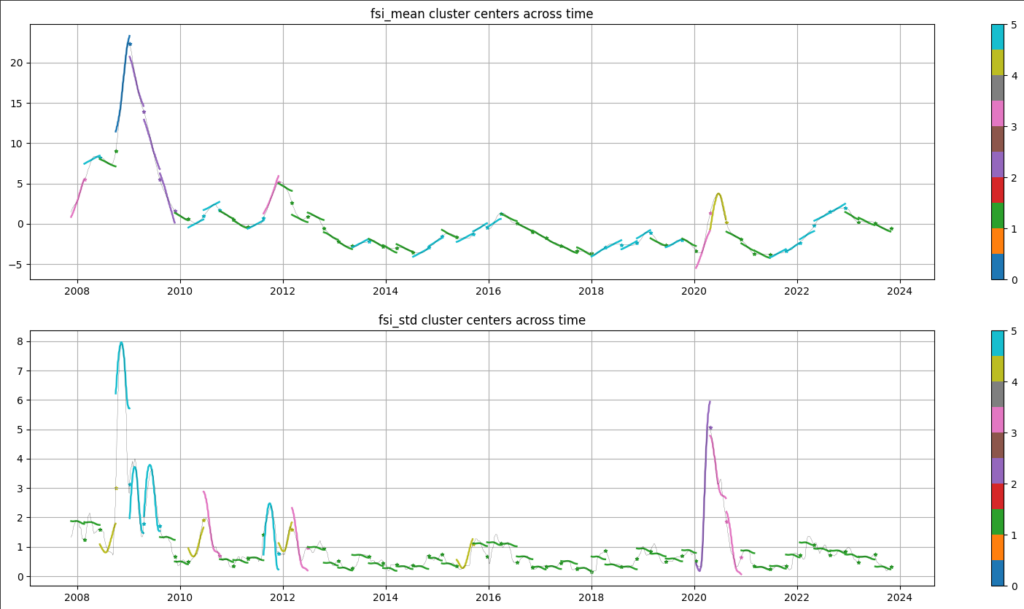
Example of the process of denoising each input dataset (FSI in this example) by clustering 3-month periods into common types (clusters) where there are similar means and std dev within the identified cluster.
Notice that this procedure naturally denoises the original ETF price series, and taking them as a whole, we’ve essentially “encoded” the “state” of all 7 series across time (as far as the average return and volatility are concerned).
These archetypal pattern shapes will form the input features to the meta-model in the next step.
3. Predictive Model Using Clustering
Using these input features above, we then move on to the next step, this time connecting these features with some target market variables.
In this case, we’re targeting both the S&P 500 ETF (SPY) and US Aggregate Bond market ETF (AGG), respectively.
Suppose we assume three states for the target variables (SPY and AGG): a good state, a medium state, and a bad state.
We now do another round of clustering that connects, historically, the input series states with the target states at some point in the future. We choose to predict 3 months out for this example.
The below chart highlights the results of this clustering for the target variable AGG:
- The top row represents the most common predicted returns and std dev for the next 3 months, for each of the three states, in this case respectively, the good, bad, and medium states.
- The bottom 7 rows are the typical shapes of the input series over the previous 3 months, each associated with a particle state of the target variable in each column.
- For example, if you were to see the AAIIS, CL, FSI, etc. look similar to what is in the first column (“good state”) we’d expect the future returns over the next three months to exhibit characteristics as highlighted in the top-left corner of the chart, in the first row — that is, a high return, but also high volatility.
- Note that we measure how “good” a state is, by its Sharpe Ratio.
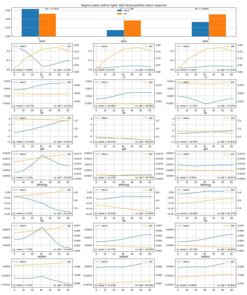
This chart shows the relationships between “target variable states,” or “regimes” and the mean and standard deviation commonly seen by each input data series (CL, GLD, etc.) during each specific state/regime. For the input data (line charts), the left y-axis is for the mean, the right y-axis is for the std dev, and the x-axis is the typical mean and std dev trend of the last 60 trading days for that variable.
So given this explanation, you can see, for example, that when AGG is in the “good state” (left column):
- AAIIS is in a trough (so investors are on net bearish)
- CL is rising (oil prices rising)
- FSI is rising (financial stress rising)
- GLD is peaking (gold prices peaking)
- IEF-HYG is declining (yield spreads compressing)
And so forth.
We also provide the “goodness of fit” R2 of the clustering, as well as entropy measures (cs % scores) reflecting the information content in each input series shape (larger is better).
4. Regime Model Portfolio Vs. 60/40 Portfolio Backtest
Not only can use such a model to understand the overall relationships between the historical input series patterns and the target variable states, but we can use this information in a historical backtest to do asset allocation more effectively.
To set this up, we divide a long-only portfolio between SPY and AGG allocations, in proportion to whether the current input series pattern features suggest either target variable will be in the good, medium, or bad state, 3 months into the future.
In applying this methodology, we obtain a set of weights between AGG and SPY across time. The chart below displays this allocation across time based on the given input data series discussed above. In this case, the chart displays the weight allocated to AGG (denote this as A) and so the weight to SPY would be 1 – A. Note, we rebalance every 3 months, to match the length of our prediction horizon.

Allocation to AGG of the Regime Model Portfolio over time.
In order to compare the cluster model approach to the static 60/40 allocation, we generate historical backtests for both setups. Subsequently, we present cumulative portfolio returns to our regime model vs. the static 60/40 allocation in the chartbelow. Note that the Sharpe Ratio goes from 0.62 to 0.68, a 10% improvement.
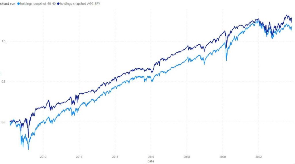
The dark blue line represents the Regime Model Portfolio and the light blue line represents the 60/40 Portfolio.
Finally, as additional information, we are able to generate a chart of the contribution of each input series towards the target variable state prediction, that’s made during each rebalance period, as shown for AGG below.
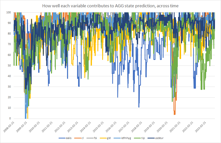
How well each macroeconomic input series variable contributes to the overall fit of the predictive model of 3 month ahead AGG return and volatility.
While this is a simple example, it provides directionality to the potential impact of leveraging a regime model as a portfolio construction enhancement.
In Conclusion
This article explores the use of quantitative regime modeling in financial markets, specifically through a machine learning-based approach using clustering to categorize market conditions into distinct regimes.
By analyzing various macroeconomic series and employing advanced statistical techniques, the model aims to improve investment strategies and portfolio construction by predicting future market states.
The model’s effectiveness is demonstrated through a backtest comparison with a traditional 60/40 portfolio allocation, showing a notable improvement in performance metrics such as the Sharpe Ratio.
- While HMM models are useful, they suffer some drawbacks, including the “curse of dimensionality” whereby the more series we try to include in our regime modeling simultaneously, the more difficult it becomes to statistically infer the hidden state. We believe our approach circumvents this issue. Moreover, HMM models are generally difficult to work with and the math involved can be quite complex.